Why typography drives App Store screenshot performance
Most users will scan your screenshot text before they inspect your UI details. If your message is hard to parse, even strong product visuals can underperform. Typography quality directly affects comprehension and conversion.
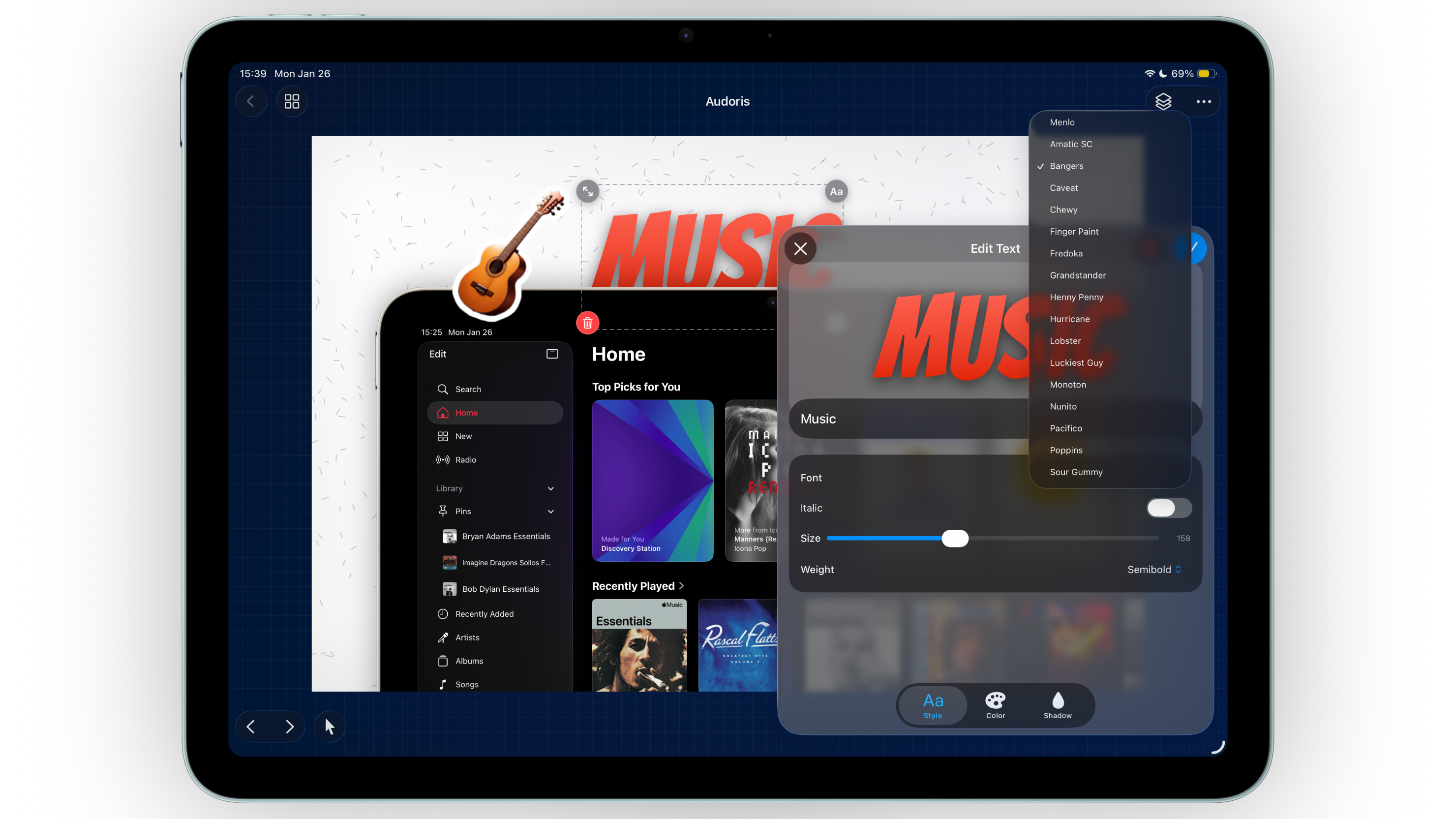
Bezel Studio helps you create a repeatable copy hierarchy with editable text layers, style controls, and layout tools that stay consistent across your full screenshot set.
- Multi-layer text editing for headline and support messaging
- Font, weight, alignment, and transform controls
- Reusable typography patterns for production speed
How to build a screenshot copy system
- Define one primary headline style. Use it for top-level value statements only.
- Create one secondary style. Reserve this for short supporting context or proof lines.
- Keep each panel focused. One core message per screenshot is easier to scan than layered claims.
- Check hierarchy at thumbnail size. If headline and subtext blur together, increase contrast or spacing.
- Duplicate approved text patterns. Reuse style systems across all canvases to avoid visual drift.
Styling text without overdesigning it
Use gradients and stroke strategically
Gradient fills and stroke effects are useful when backgrounds vary in brightness. Use them to improve readability, not to create decoration for its own sake.
Shadow should support contrast, not create blur
Small shadow adjustments help text separate from busy backgrounds. Heavy shadows make screenshots look older and less refined.
Align text to composition flow
Match text alignment to frame placement so the eye moves naturally from headline to UI proof point.
Typography in screenshot design is product communication, not poster art.
Common typography mistakes
- Using too many font styles in one screenshot set
- Overloading panels with long headline sentences
- Applying strong visual effects that reduce legibility
- Ignoring alignment consistency between canvases
- Skipping small-size readability checks before export
FAQ: App Store screenshot typography
How many font styles should I use in one set?
Usually one primary and one secondary style are enough for a clean, conversion-focused hierarchy.
Should I use gradient text in every screenshot?
No. Use gradient fills only where they improve contrast or highlight key messaging.
What is the best way to test readability?
Preview your screenshots at small App Store sizes. If the message is clear in two seconds, the typography is working.