Why layer control matters for screenshot production
As soon as a canvas includes text, frames, badges, and annotations, layer structure becomes critical. Without clear ordering, elements overlap unpredictably and layouts drift between canvases.
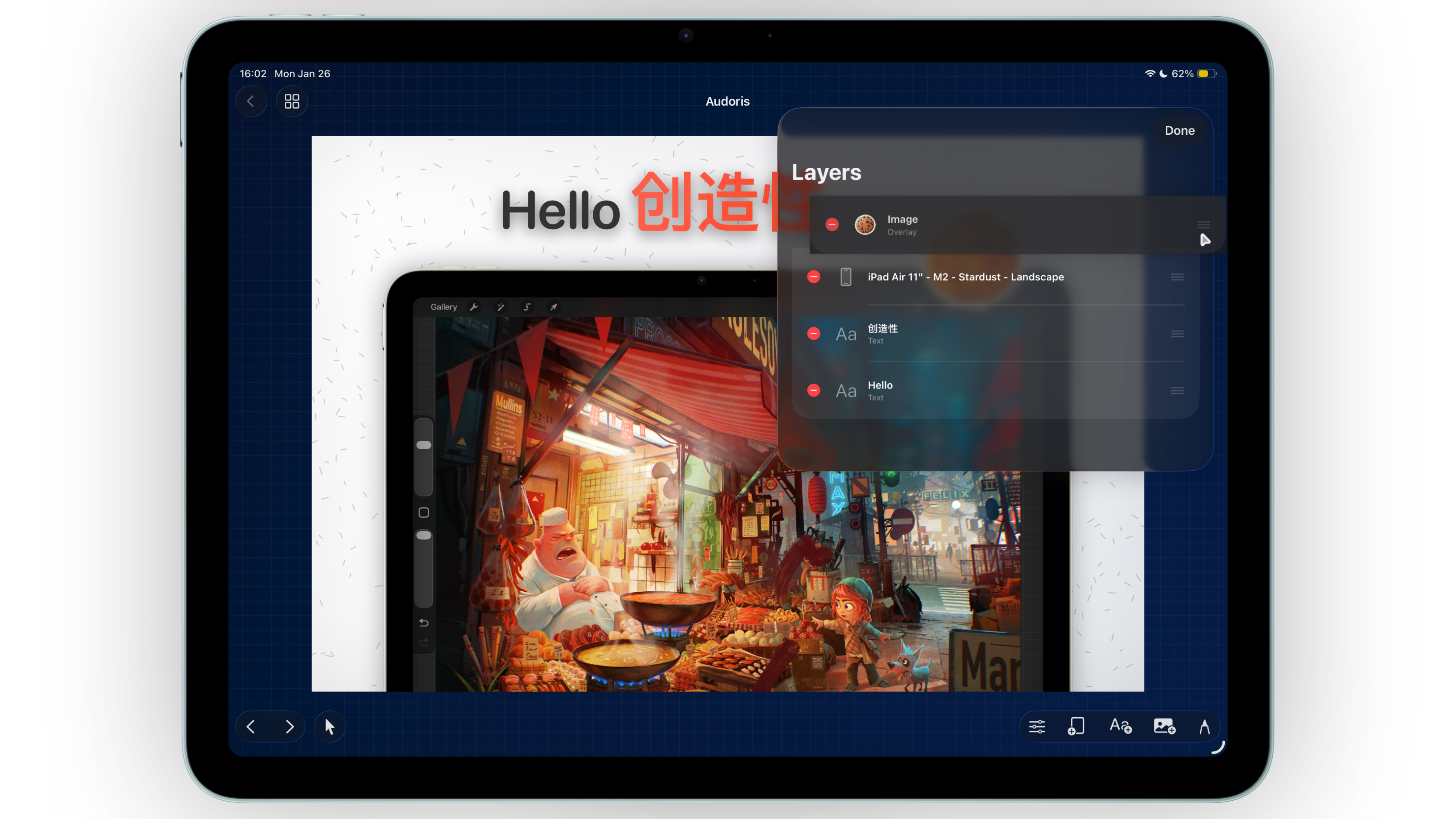
Bezel Studio solves this with a layer list that makes reordering explicit. You can adjust hierarchy quickly and keep every screenshot in your set visually consistent from panel to panel.
- Unified layer system for text, image, and frame elements
- Direct reordering to control foreground and background hierarchy
- Quick cleanup with delete and edit actions
How to organize layers in Bezel Studio
- Set base structure first. Add background style, then frames, then text and callouts.
- Group by message priority. Keep primary headline and hero frame in dominant visual positions.
- Use layer panel to fix overlaps early. Resolve stacking issues before polishing colors and spacing.
- Duplicate stable canvases. Once one panel is balanced, duplicate and update content to preserve alignment rhythm.
- Finalize with zoom checks. Use zoom and pan for tight spacing corrections before export.
Alignment and spacing strategy for App Store mockups
Let snapping do the mechanical work
Guides and snapping reduce manual guesswork and keep repeating distances consistent, especially across multi-canvas screenshot sets.
Check both macro and micro layout
Start by balancing the full canvas composition. Then zoom in for fine adjustments around typography, sticker edges, and frame margins.
Prioritize predictable hierarchy
Users should instantly see: headline first, product proof second, support visuals third. Layer discipline reinforces that flow.
Precision is not about perfectionism. It is about making each screenshot easy to read in under two seconds.
Common layer and layout mistakes
- Reordering elements late in the process instead of early
- Ignoring snap guides and manually eyeballing every position
- Mixing different spacing systems between canvases
- Overlapping text and frames in ways that reduce readability
- Skipping zoom-level QA before final export
FAQ: precision layout for screenshots
Do I need a layer workflow for simple screenshots?
Even simple canvases benefit from layer order. It helps maintain consistency when you scale from one screenshot to many.
How can I keep spacing consistent across a full set?
Use snapping, duplicate proven layouts, and run a quick side-by-side review before export.
Is zoom editing really necessary?
Yes for final polish. Small alignment errors become obvious in App Store carousel view.