Why drawing helps App Store screenshot communication
Strong screenshot marketing is about clarity. Sometimes text alone is not enough to show where a user should look. A subtle arrow, underline, or highlight can instantly explain a flow and reduce cognitive load.
For onboarding-heavy apps and feature-rich interfaces, drawing overlays are especially useful. They help convert complex screens into simple visual stories that are easier to scan in App Store search results.
- Quick visual callouts for key actions and features
- Faster iteration compared to exporting into other editors
- Layer-based workflow that stays editable inside your project
How to annotate screenshots in Bezel Studio
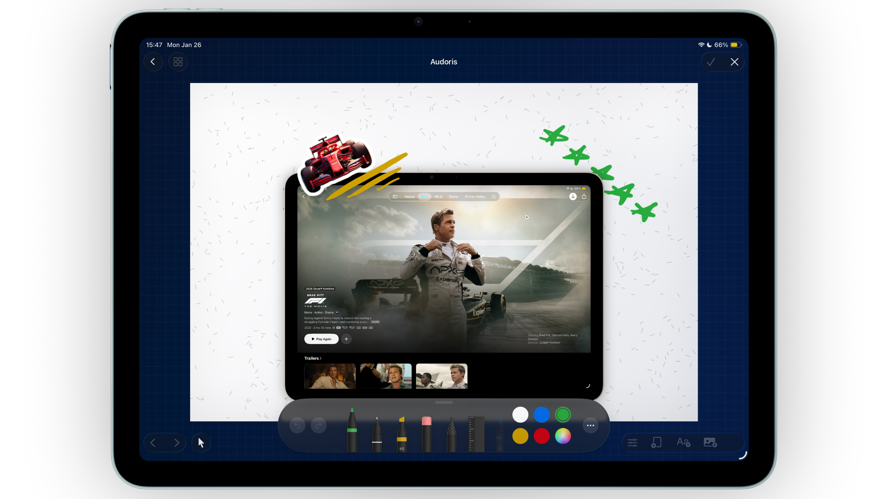
- Prepare your base canvas first. Add device frames, text, and background styling so your drawing marks can match final composition.
- Enter drawing mode for focused sketching. Add arrows, circles, and path marks that direct attention to one feature at a time.
- Commit the drawing as a layer. Once confirmed, the sketch becomes part of your layer stack and can be positioned like any other element.
- Refine placement with layer controls. Move or reorder drawing layers to keep hierarchy clean around text and frames.
- Duplicate canvases for consistency. Reuse annotation patterns across a full screenshot set instead of redrawing from scratch.
Keeping doodles professional for ASO creatives
Keep stroke language consistent
If one screenshot uses clean arrows and minimal marks, keep that style across the entire set. Mixed annotation styles can make the page feel unpolished.
Use drawings to support text, not replace it
Drawings should guide attention toward your main headline and UI proof point. They work best when paired with concise copy.
Check readability on small previews
Always zoom out and review the screenshot at store-listing scale. Annotation details that look good large can become noisy in smaller previews.
Clear annotations feel intentional and quiet. Loud annotations usually signal unclear messaging.
Common drawing mistakes
- Over-annotating one canvas with too many lines or symbols
- Using conflicting colors between doodles and brand palette
- Placing arrows where they overlap core UI content
- Adding marks before locking the main layout
- Ignoring layer order and hiding key copy behind drawings
FAQ: drawing on App Store screenshots
Can I edit drawings after adding them?
Yes. Drawings become layers, so you can move and reorder them as your screenshot layout evolves.
Should every screenshot include doodles?
No. Use annotations where they improve understanding. Some screenshots are stronger with clean typography only.
Do drawing overlays help conversion?
They can, when they make the message clearer. The goal is always faster understanding, not extra decoration.