Why device frames matter for App Store screenshot conversion
A strong App Store screenshot maker should do more than place text on a background. It should help users understand your product context immediately. Device framing does exactly that. Instead of floating UI elements, your screenshots appear in recognizable Apple hardware, which improves trust and clarity.
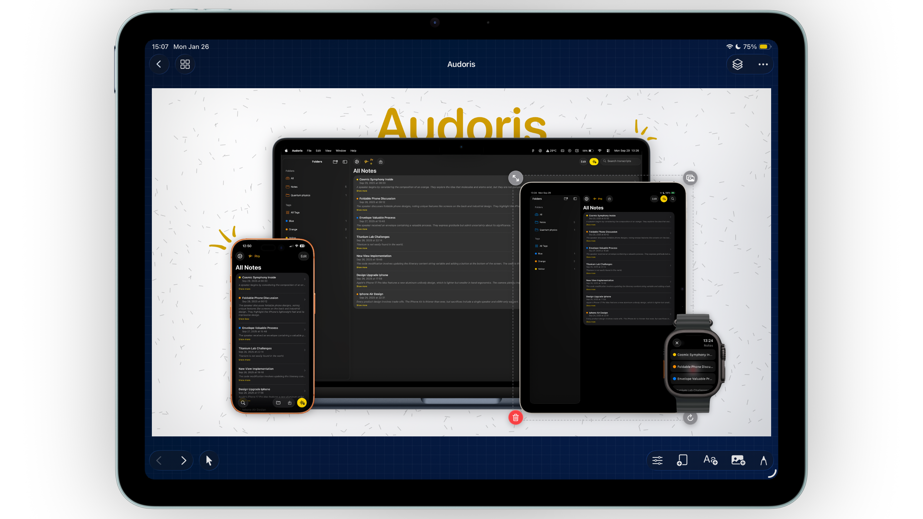
This is especially useful when you are marketing across iPhone and iPad at the same time. A clear frame hierarchy tells viewers which experience they are looking at and keeps your story coherent from screenshot one to screenshot ten.
- Supports iPhone, iPad, Apple Watch, and Mac frame mockups
- Works with both static screenshots and screen recordings
- Keeps marketing visuals consistent across campaigns
How to build polished frame layouts in Bezel Studio
If you are setting up your first launch set, use this process. It is simple, repeatable, and optimized for App Store screenshot workflows.
- Pick your primary target device first. Start with your main conversion surface, usually iPhone. Build one strong master canvas before creating variants.
- Add your screenshot or screen recording. For motion-focused product highlights, drop a video into the frame. For feature-by-feature storytelling, use static screens.
- Adjust scale, rotation, and offset. Keep frame angle subtle. Small corrections usually look more professional than dramatic transforms.
- Use alignment guides. Snap helps maintain visual rhythm across panels, especially when you duplicate canvases for a full screenshot set.
- Duplicate and swap content, not layout. Reusing the layout structure saves time and preserves brand consistency.
Pro tips for ASO screenshot design with frames
Use one hero frame per screenshot
Resist the urge to overfill. One dominant frame with clear copy often outperforms crowded compositions in App Store listing tests.
Match frame style to brand tone
Bright consumer apps can handle playful layouts. Productivity and fintech apps usually convert better with cleaner frame placement and tighter spacing.
Keep background contrast intentional
If your interface is light, choose a slightly darker or richer background so the frame stays readable. If your UI is dark, give it breathing room with lighter contrast.
Great screenshot design is less about effects and more about sequencing: frame, headline, proof, and next action.
Common frame mistakes that reduce clarity
- Using different frame scales on every screenshot without a reason
- Over-rotating devices until UI readability drops
- Mixing too many device categories in one canvas
- Ignoring snap guides and ending up with uneven spacing
- Changing visual style every panel instead of building a cohesive set
FAQ: device frame mockups for App Store screenshots
Can I use videos inside iPhone frames?
Yes. Bezel Studio supports screen recordings in frames, which is useful for feature demos and motion-driven launch creative.
Should I use the same frame on every screenshot?
Usually yes, with minor variation. Consistency helps users scan quickly, especially on App Store search traffic.
Do frame mockups help ASO?
They can improve perceived quality and comprehension, which often supports higher conversion from product-page visits.