Why canvas styling matters for App Store screenshot design
Users make fast decisions on the App Store. Your background system needs to support the product message, not distract from it. A thoughtful background can increase text readability, make frames stand out, and guide attention toward the exact feature you want to promote.
If you are optimizing for conversion, consistent styling across your screenshot set is just as important as good copy. Bezel Studio helps you create that consistency with reusable presets and controlled visual layers.
- Theme presets for quick, polished starting points
- Custom gradient controls for brand-specific color systems
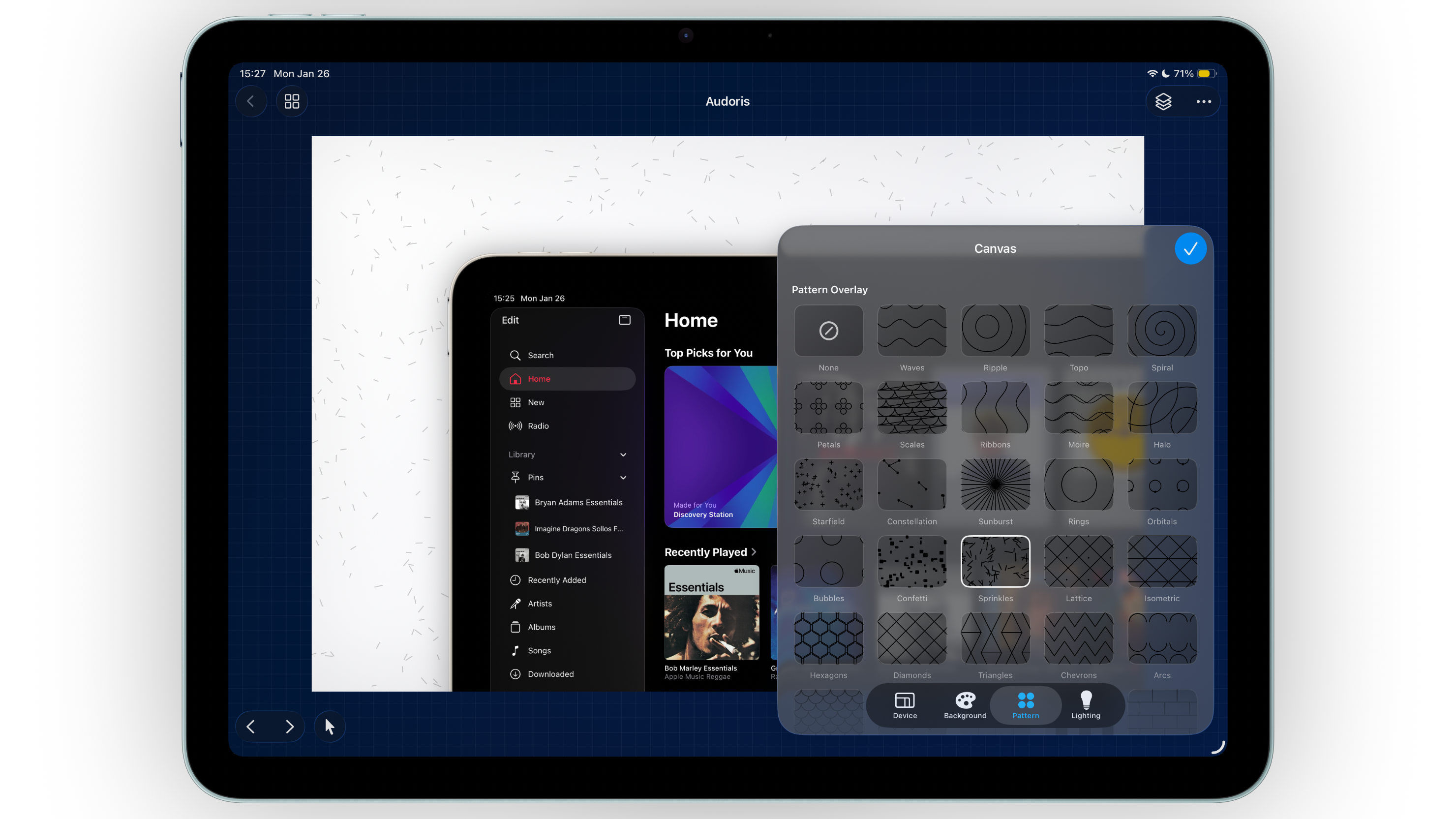
- Photo, pattern, and lighting tools for depth without clutter
How to style App Store screenshot backgrounds step by step
- Start with one base style. Pick a theme or custom gradient that matches your app category and brand voice.
- Set contrast before details. Confirm headline text and frame edges are readable against the background first.
- Add one pattern overlay. Keep opacity low so the pattern adds texture but does not compete with product UI.
- Use lighting as a directional cue. Place subtle light where you want the eye to travel first, usually near the hero headline or primary frame.
- Save your setup as presets. Reuse gradients and size presets so future screenshot updates stay visually aligned.
Balancing patterns and lighting for cleaner mockups
Pattern should support, not dominate
Pattern overlays are most effective when they are barely noticeable at first glance. Their job is to prevent flatness, not steal attention from your app interface.
Use one lighting direction per canvas
Mixed light directions can make compositions feel inconsistent. Choose a primary light direction and repeat that logic across the whole screenshot set.
Create variation through intensity, not style changes
Instead of switching from one visual language to another, adjust opacity, position, and scale while keeping the same core gradient system.
The best screenshot backgrounds feel designed, but almost invisible. They let the product story lead.
Common canvas styling mistakes
- Using high-contrast patterns behind dense text
- Changing gradient palettes too aggressively between canvases
- Applying heavy lighting on every panel
- Prioritizing visual effects over message clarity
- Skipping preset saves and rebuilding styles from scratch every time
FAQ: screenshot background styling
Should I use photo backgrounds for App Store screenshots?
Yes, if the photo supports your story and contrast remains strong. Avoid busy photos that reduce text readability.
How many colors should a gradient use?
Two to three colors usually look the cleanest for app marketing visuals. More colors can work, but require tighter control.
Can I reuse styles across different projects?
Yes. Save gradients and size presets, then apply them across projects for faster and more consistent output.